
Photographing Mamee Jonker House, Melaka
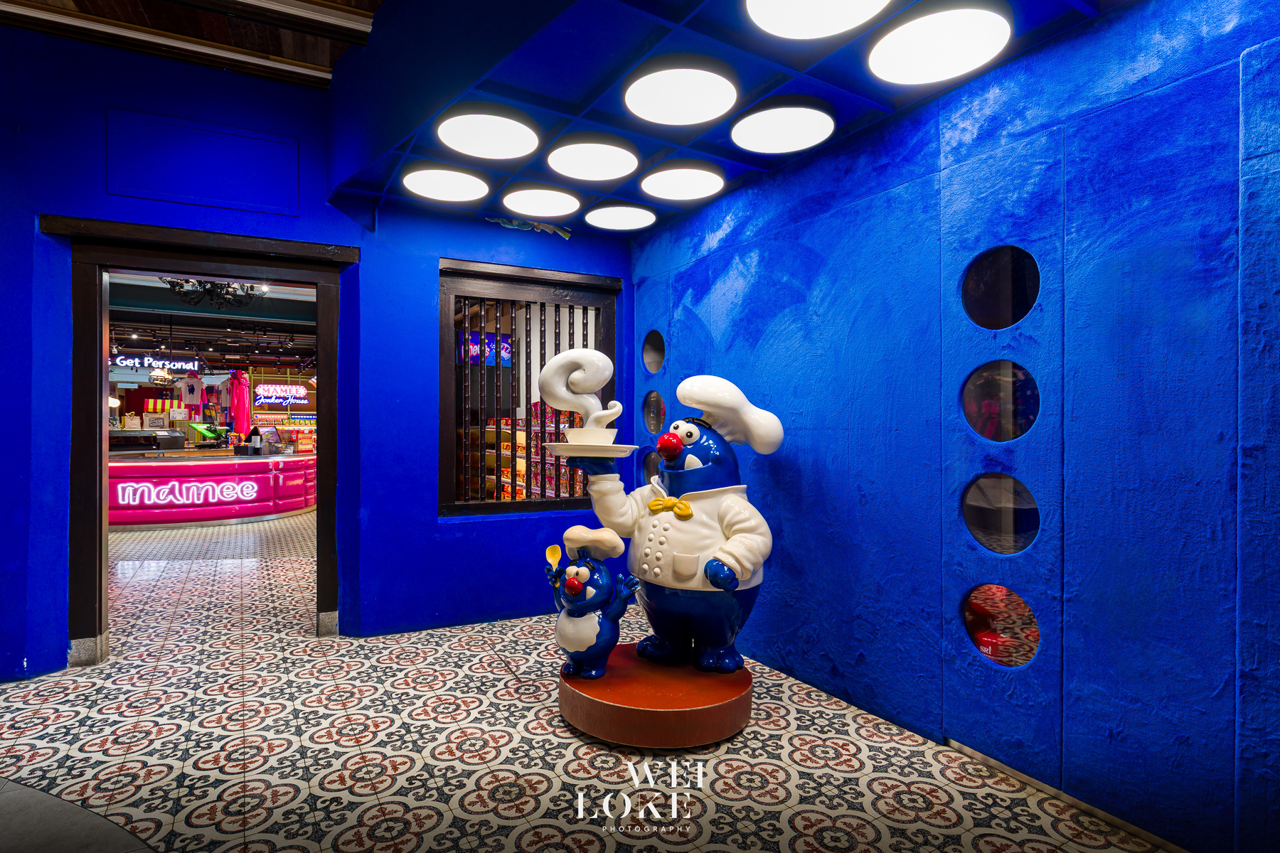
When Moxie first approached me to photograph Mamee Jonker House in Melaka, they sent over a few photos of the completed space.
My first thought was: this is not going to be easy to photograph.
Not because the space lacked character — quite the opposite.

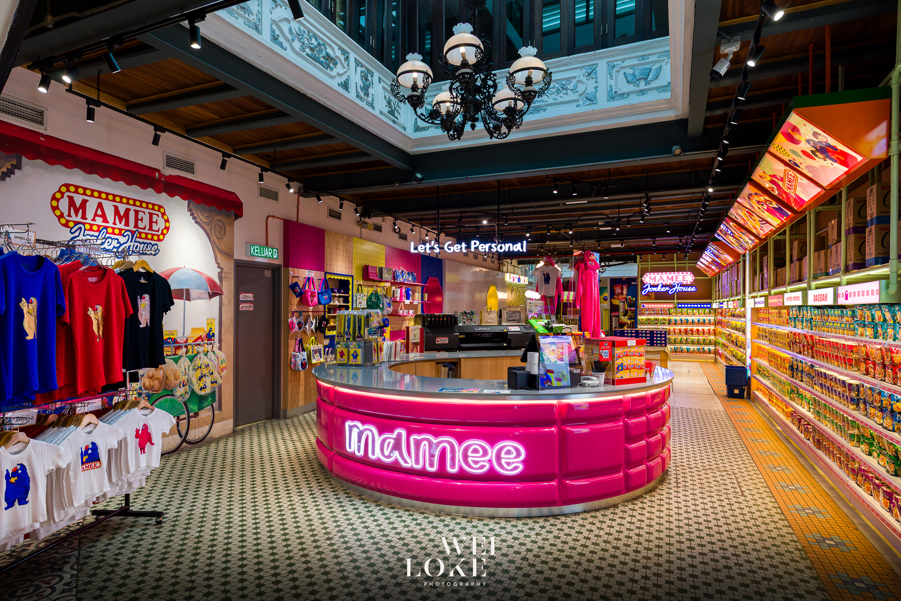
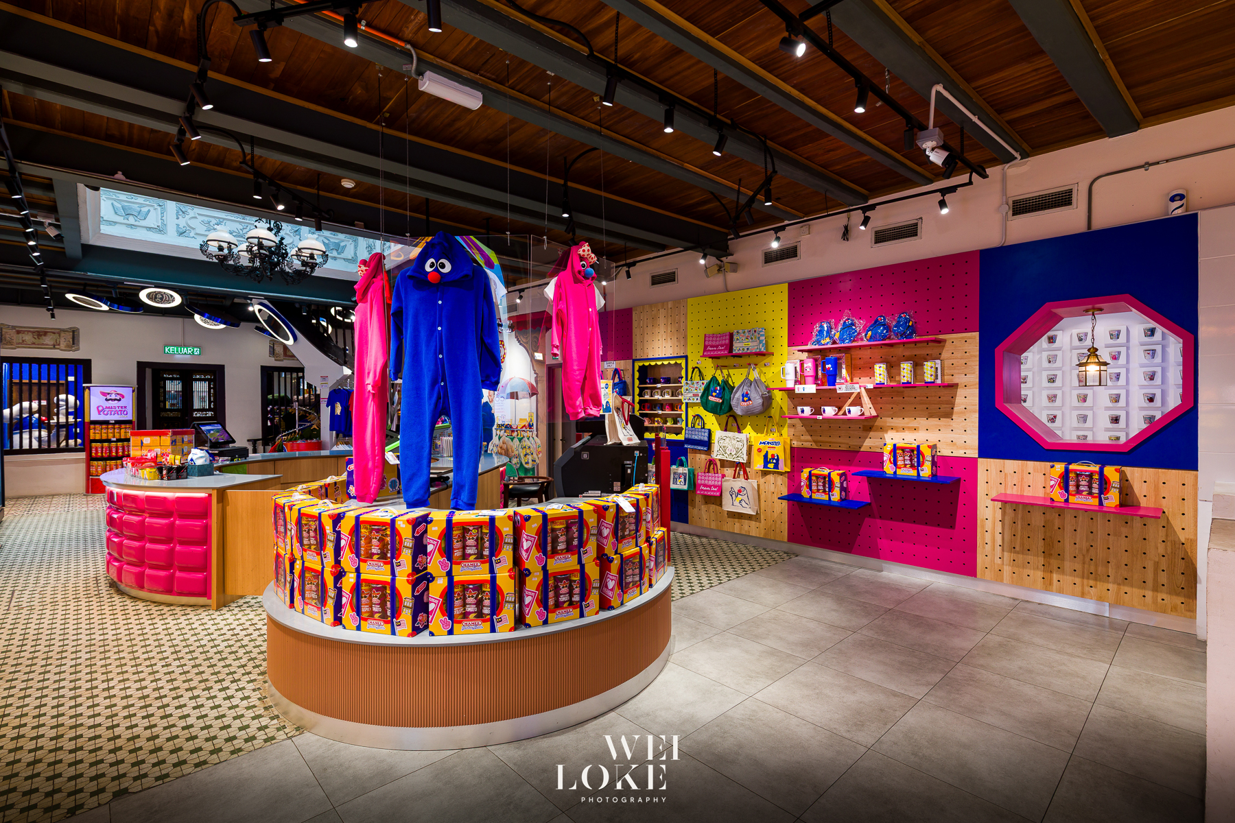
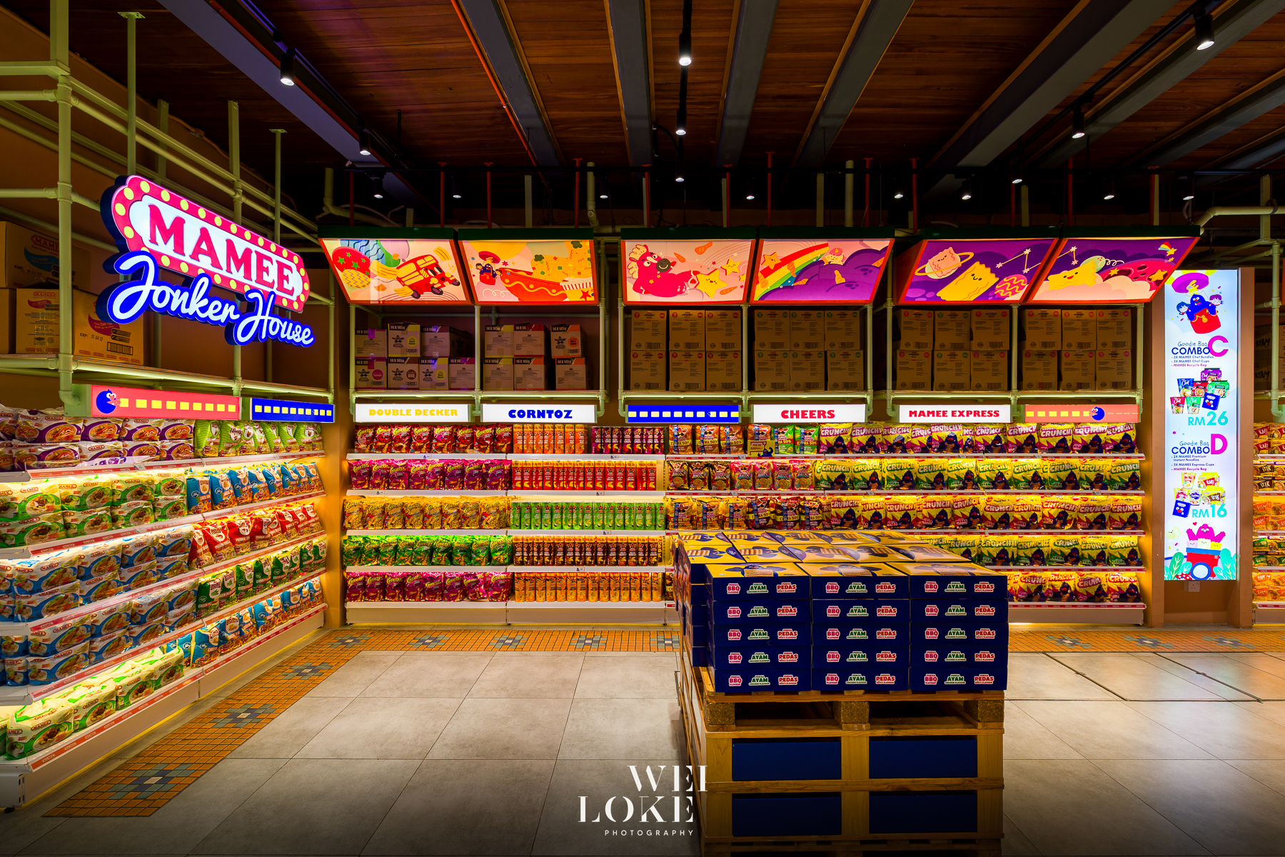
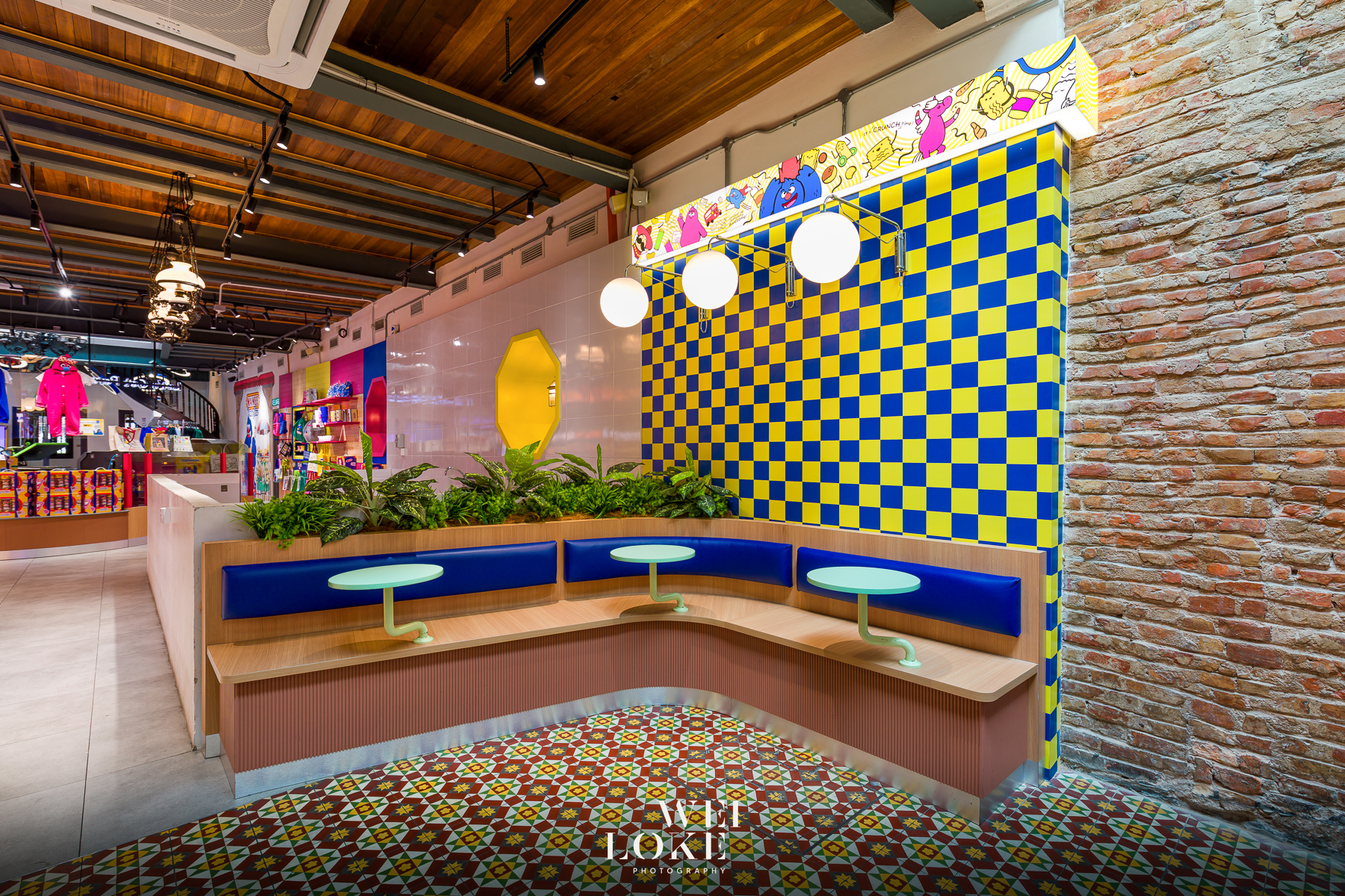
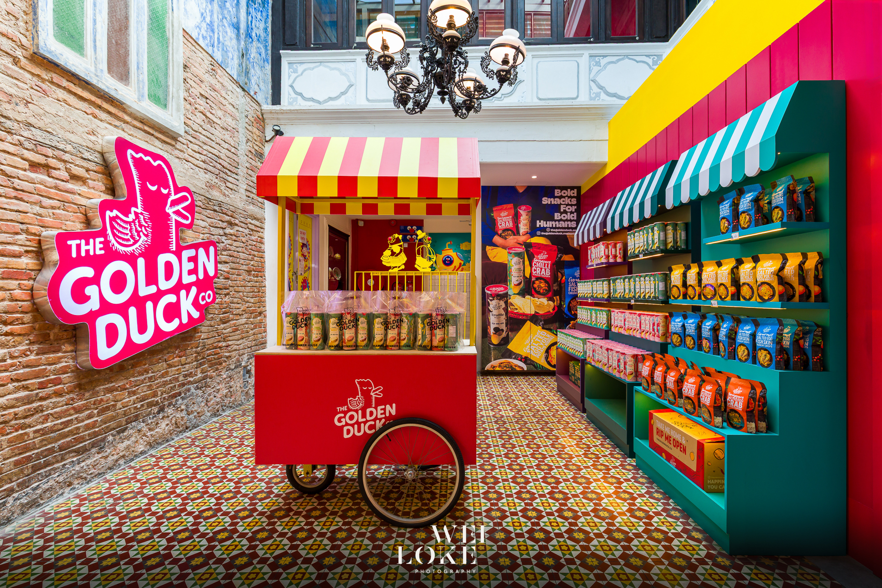
There was a lot happening at once: colourful product packaging, merchandise, illuminated signage, patterned flooring, exposed brickwork, heritage architecture, display fixtures and different brand identities all sharing the same space.
For a visitor, that energy is part of the experience.
For a photographer, it creates a different challenge.

Where should the eye look?
The objective was not simply to fit as much as possible into each frame. I needed to find compositions that could organise all that visual information and still communicate Moxie’s interior design clearly.
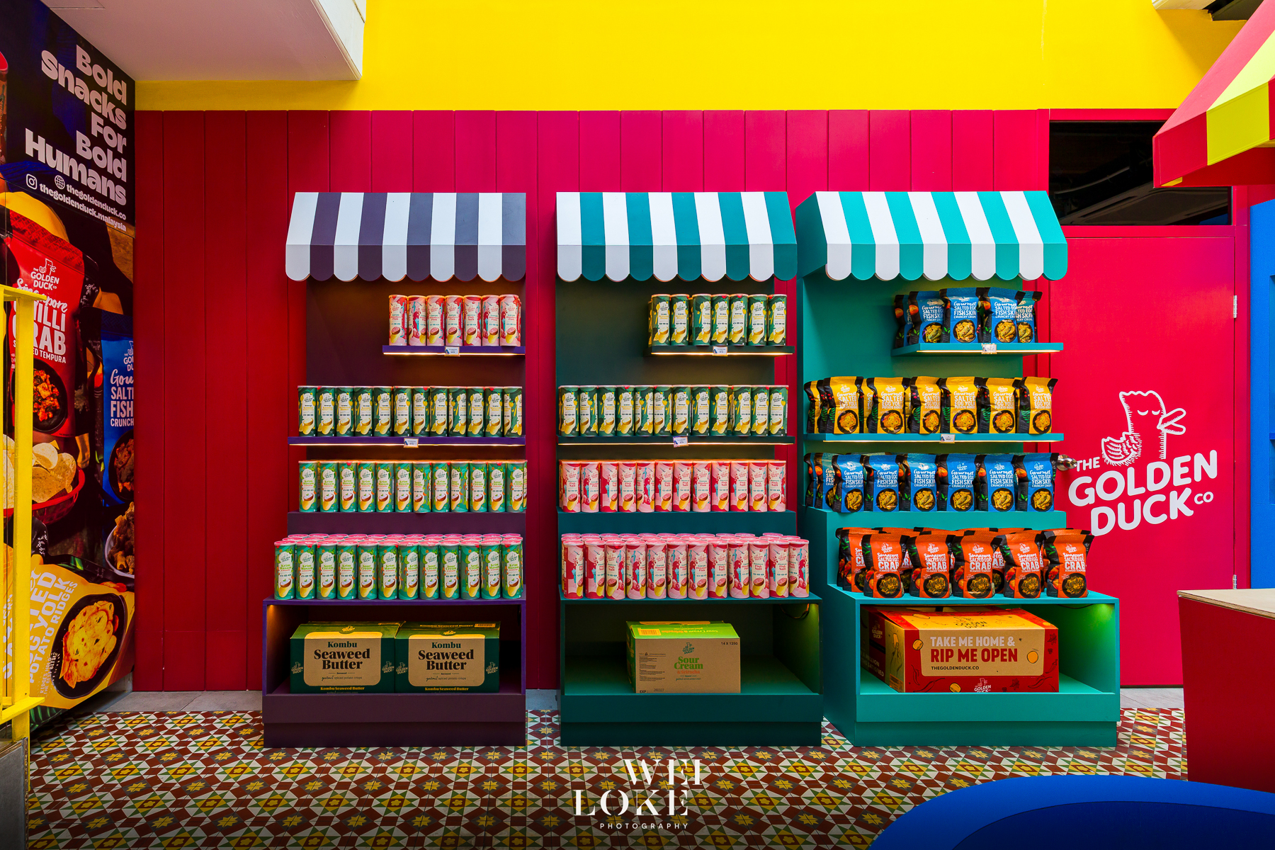
Some angles were deliberately wider to establish the relationship between the retail displays and the original architecture. Others were much more controlled, isolating individual zones through symmetry, colour blocks, leading lines and strong foreground elements.

The Golden Duck section, for example, was already extremely colourful. Instead of trying to simplify it artificially, I used the geometry of the displays and architecture to give that colour a structure within the frame.
The same thinking applied throughout the shoot.
A visually busy space doesn’t necessarily need a simpler photograph. It needs a clearer composition.

That became the approach for photographing Mamee Jonker House — not removing its energy, but finding enough order within it for the design to speak.
Project Credits
Project: The Mamee Gallery
Interior Design: A Moxie Associates
Build: Dream Team Builder
Photography: WeiLoke Photography