A New Chapter in Store Design
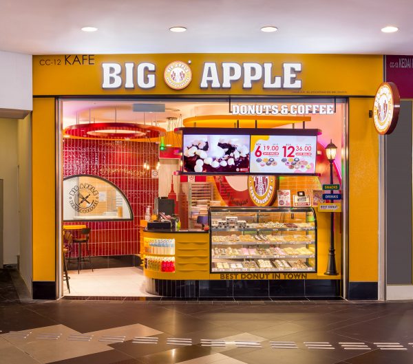
Partnering with the renowned Japanese design company, Semba, I was tasked with capturing the essence of Big Apple’s newly revamped store at NU Sentral, Kuala Lumpur.

A Fresh Take on Tradition
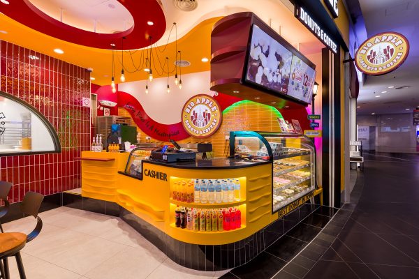
Big Apple, a beloved name in the world of donuts, has always stood for quality and innovation. The brand’s latest store design reflects a modern twist on its rich tradition, combining vibrant colors with sleek, contemporary elements. Semba’s design vision brings a fresh perspective to the brand, blending the dynamic energy of New York City with a warm, inviting ambiance.

Bringing the Design to Life Through Photography
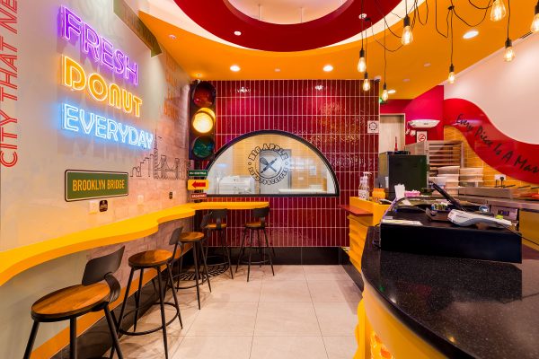
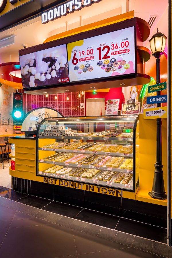
Photographing this space was a delightful challenge. The interplay of light, color, and texture created by Semba’s design presented an opportunity to capture the vibrancy and energy that the new Big Apple store embodies. From the bold red and yellow accents to the intricate details in the lighting and seating arrangements, every element was meticulously designed to enhance the customer experience.

A Space That Speaks to Every Customer
What struck me most was how the design doesn’t just serve an aesthetic purpose but also creates a narrative. The neon signs, inspired by New York’s iconic landmarks, and the cozy seating areas invite customers to sit back, relax, and enjoy their favorite donuts in style. This project was about more than just photographing a store—it was about capturing a space that resonates with every visitor.

Looking Ahead
As a photographer, working with a design powerhouse like Semba has been incredibly rewarding. It’s collaborations like these that remind me why I love what I do—bringing design, architecture, and brand identity together in a single frame to tell a compelling story.
I’m excited to see how this new design direction will shape the future of Big Apple, and I’m proud to have played a part in documenting this journey.
